COLOR
ACTIVIDADES PARA EL 5 DE JUNIO (MÁS ALLÁ DE ESTA FECHA NO SE RECOGERÁ NADA)
Read pages 32 and 34.
Watch this short video to understand better how primary colors (pigments ) work.
Pigments...do you know what is a pigment ( in Art)?
Watch this curious video about PIGMENTS.
Read also, the following information.
Watch this short video to understand better how primary colors (pigments ) work.
Pigments...do you know what is a pigment ( in Art)?
Watch this curious video about PIGMENTS.
Read also, the following information.
1. The colour
wheel.
1. 1. Definition.
The colour wheel is a visual framework used
for facilitating the understanding of colour and:
- We can sort primary and secondary colours.
- We
can group warm and cool colours.
- We
can analize the complementary colours.

1. 2. Warm and cool colours. One way to group colours is to associate
them with a temperature.
2.1. Cool
colours. Many natural elements
transmit a sense of cool, for example,
snow, ice, water, sky, etc, …Cool colours are mainly bluish, violet or greenish colour with more than 50%
of blue in their mixture.
2.2.Warm colours. Warm colours convey a sensation of warmth. They are many elements in nature that
transmit the idea of heat, such as the sun, fire, summer,
the desert…Their hues are yellows, oranges and reds with more than 50% of yellow in their mixture. Red is the warmest colour.
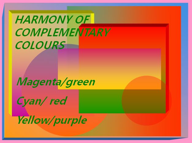
1. 3. The complementary colours.
A colour is
complementary to another when it does not contain any amount of the opposite colour.
For example, yellow is complementary to violet because it contains nor blue or
magenta, which are the colours that make up violet. They are opposite in the color wheel.
These colour pairs are magenta/green, yellow/violet and red/cyan.

2. Colour
harmonies.
We can establish relationships between colours.
To create a combination of colours that is agreeable to the eye we must look
for what we call as colour harmony.
There are five simple ways to create colour
harmonies:
2.1. Warm
colours harmony: Use the warm colours that you already know: red,
orange, yellow, brown…

2.2. Cool colours harmony: Use the cool colours that you already know: blue, green, violet…

2.3. Complementary colours harmony: In spite of being the most contrasted colours in the colour wheel, putting them together creates an interesting and eye-catching sensation of harmony.


2.2. Cool colours harmony: Use the cool colours that you already know: blue, green, violet…

2.3. Complementary colours harmony: In spite of being the most contrasted colours in the colour wheel, putting them together creates an interesting and eye-catching sensation of harmony.
2.4. Colour
families: These colours are next
to each other on the colour wheel.

2.5. Value ranges: This kind of harmony consist on mixing one colour with black or white or using colours with the same value of darkness or lightness.

2.5. Value ranges: This kind of harmony consist on mixing one colour with black or white or using colours with the same value of darkness or lightness.

3. The meaning
of colour.
We can use colours to transmit feelings and thoughts.
3.1. Cold
and warm colours. Cold colours have been
associated with infinity, calm, transparency, spirituality, solemnity. Warm
tones are related to passion, festivities, happiness and sometimes with war,
death, and destruction.
3.2. The
colours of the rainbow. These colours symbolize
a lot of things such as:
Color Symbolism Chart
|
|
Red: Excitement, energy, passion, love, desire, speed, power, heat, danger, fire, blood, war, violence.
|
|
Pink symbolizes love and romance, tenderness and calm.
|
|
Beige and
ivory: Quiet, pleasantness, simplicity.
|
|
Yellow signifies joy, happiness, optimism, idealism, imagination, jealousy, illness.
|
|
Blue: Peace, tranquility, cold, calm, stability, harmony, confidence, order, loyalty, technology, sadness.
|
|
Turquoise symbolizes calm, sophistication.
|
|
Purple: Royalty, nobility, spirituality, ceremony, mysterious, wisdom.
|
|
Lavender symbolizes femininity, grace and elegance.
|
|
Orange: Energy, enthusiasm, warmth, vibrant, expansive.
|
|
Green: Nature, environment, healthy, good luck, spring, malice.
|
|
Brown: Earth, stability, home, reliability, simplicity
and comfort.
|
|
Gray: Reliability, intelligence, modesty, dignity, maturity,
solid, old age, sadness, boring.
|
|
White: Purity, birth, simplicity, cleanliness, peace, innocence,
youth, winter, snow, good.
|
|
Black: Power, sophistication, formality, elegance, mystery, fear,
unhappiness, sadness, night ,
death.
|
|
Marco wants to share with us this engaging video about the meanings of color.
THANK YOU VERY MUCH!
ACTIVITY 1.
NOW ASK THE FOLLOWING QUESTIONS TO TEST YOUR KNOWLEDGE.
ACTIVITY 2.
DO THE ACTIVITY IN THE TEXTBOOK. DON´T FORGET THAT YOU MUST USE PRIMARY COLORS (MAGENTA -NEAR TO PINK COLOR- YELLOW AND CYAN) TO MAKE THE RIGHT MIXES. YOU MUST USE ONLY COLORED PENCILS. TRY TO BE ACCURATE WITH TECHNIQUE.


ACTIVITY 3. (OPTIONAL)
DO THE ACTIVITY IN THE TEXTBOOK WITH THESE NEW INSTRUCTIONS.
COPY THE LANDSCAPE UNDER THE FIRST IMAGE.
COLOR BOTH LANDSCAPES USING DIFFERENT KIND OF HARMONIES. (REMEMBER THERE ARE 5 DIFFERENT HARMONIES)
I WILL PAY ATTENTION TO THE QUALITY OF DRAWING AND THE GOOD TECHNIQUE OF COLOR PENCILS. (CUIDADO CON LOS RALLAJOS)


Comentarios
Publicar un comentario